Visual Identity Guidelines: Mozilla Foundation
Mozilla Foundation Logo/Wordmark Usage
The Mozilla Foundation logo/wordmark is to be displayed in its entirety on either a solid light or dark background (avoid mid-tone or strongly colored backgrounds). The logo should not be displayed in parts, with color variations, or with other elements superimposed on top of the logo.
The should not be displayed on screen with the logo portion at a size any smaller than 24px tall. The logo should not be displayed in print with the logo portion at a size any smaller than 3/8" tall.


Mozilla Foundation logo on white, on black, in grey-scale, and in black-and-white
The “Mozilla Foundation” text should be rendered in the MetaBoldLF-Roman font in the appropriate size in relation to the logo as indicated in the figures above. The text must be rendered in solid black when display on a light background, and solid white when displayed on a dark background (avoid mid-tone backgrounds).
Common Mistakes
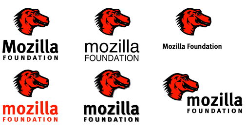
The Mozilla Foundation logo/wordmark should not be displayed in modified or displayed in ways that visually compromise the logo. The following figures highlight some common mistakes to avoid when displaying the logo and wordmark.

Common Logo/Wordmark Mistakes (clockwise from top-left):
incorrect capitalization, incorrect font, incorrect font size and orientation, incorrect font color, shadow added, non-standard orientation of logo to text

Common Wordmark Mistakes (left-to-right):
strongly colored background, strong patterned background, incorrect colors