|
Mozilla: Mail
|
Screen Shots
|
|
Secure Messages
|
Last Modification:
|
|
|
Team:
|
|
Author: Jennifer Glick
Creation Date:
|
Status:
|
Note: All icons used here are placeholders only
and will be re-done by a graphics person.
Option 1


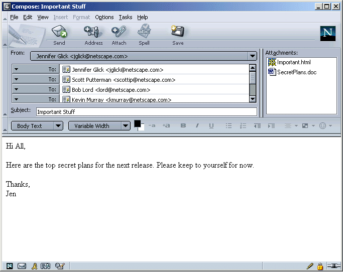
- Message opens with defaults as user specified in
Preferences.
- User uses Option menu to select per message options.
- Status bar icons are used to indicate state, not
intent.
- Intact pen Only appears when the message is signed, either per
Preferences or per this message only (Options menu).
- Only show the broken pen when the user wants to send this
message signed but can't for some reason (is this a valid
scenario?).
- Show No pen icon at all if signing is turned off (user not
interested, don't annoy them with it).
- The lock icon as closed when the message can be sent encrypted
and encryption is turned on.
- Open lock when message can't be sent encrypted and encryption
is turned on.
- No lock if encryption is not turned on.
Pros: Clean design. Only users interested in security who turn on
signing or encryption see the icons.
Cons: Is it discoverable enough? Conflicts with SSL in status
bar?
Option 2


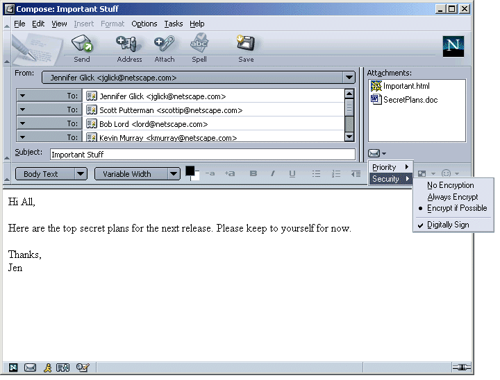
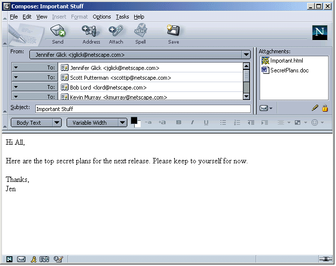
- Area below attachments is used for message options.
- Message opens with defaults as user specified in
Preferences.
- User uses Option menu in menu toolbar or Option menu below
attachment area to select or change per message options.
- Status of options displayed below attachment area.
- Icons are used to indicate state, not intent.
- Intact pen Only appears when the message is signed, either per
Preferences or per this message only (Options menu).
- Only show the broken pen when the user wants to send this
message signed but can't for some reason (is this a valid
scenario?).
- Show No pen icon at all if signing is turned off (user not
interested, don't annoy them with it).
- The lock icon as closed when the message can be sent encrypted
and encryption is turned on.
- Open lock when message can't be sent encrypted and encryption
is turned on.
- No lock if encryption is not turned on.
Pros: More discoverable. Other options such as Priority can use
this area as well. Only users interested in security who turn on
signing or encryption see the icons.
Cons: Is there enough space below the attachment area?
Option 3

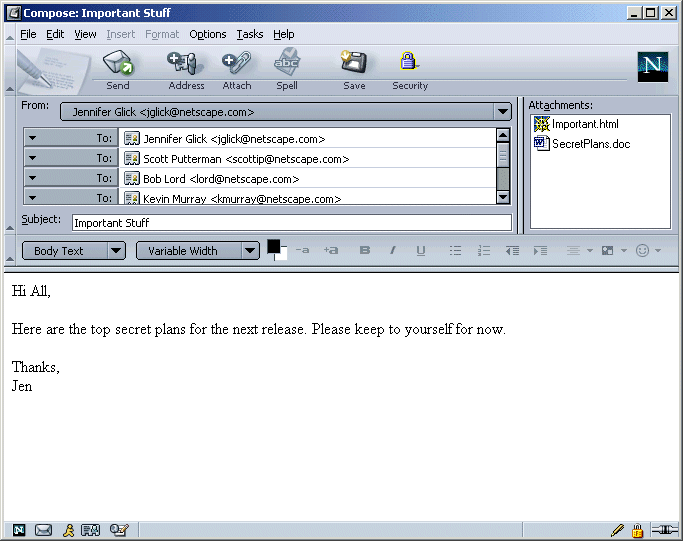
- Toolbar button used to select security options.
- Message opens with defaults as user specified in
Preferences.
- Status of security features displayed in Status bar.
- Icons are used to indicate state, not intent.
- Intact pen Only appears when the message is signed, either per
Preferences or per this message only (Options menu).
- Only show the broken pen when the user wants to send this
message signed but can't for some reason (is this a valid
scenario?).
- Show No pen icon at all if signing is turned off (user not
interested, don't annoy them with it).
- The lock icon as closed when the message can be sent encrypted
and encryption is turned on.
- Open lock when message can't be sent encrypted and encryption
is turned on.
- No lock if encryption is not turned on.
Pros: More discoverable.
Cons: Adds another button to toolbar that users who are not
interested in security many never use. Conflicts with SSL in
status bar? What about other options like "Priority", should they get
their own button in the toolbar as well?


