|
Mojo/Mozilla: Mail: Attachments |
UI Proposal
|
|
Attachments in an Open Msg |
Last Modification: |
|
Author: Jennifer Glick |
Status: Proposal |
||||||||||||
|
Quicklinks: |
Feature Team
Please post all comments and suggestions regarding this spec to the newsgroup, netscape.public.mozilla.mail-news. |
Summary
In an open message, make attachments more apparent and accessible to users.
Design Details
Current Design
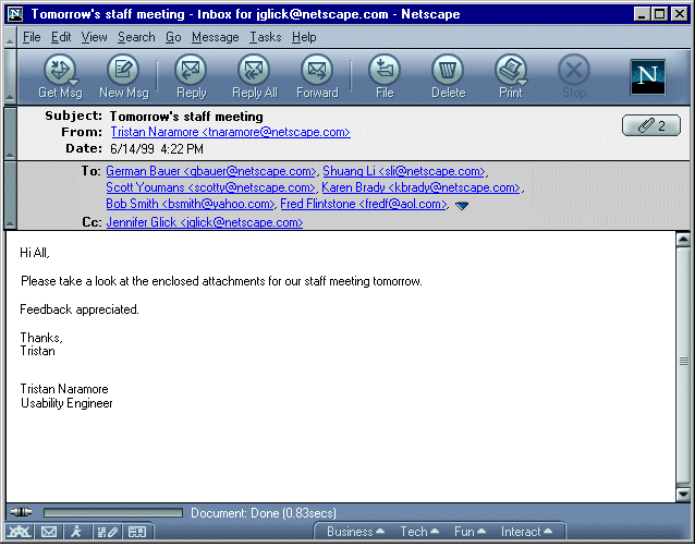
Attachment button in top right corner of envelope area, which indicated the number of attachments. Clicking the button displays a list of attachments, allowing users to open or save individual attachments or save all the attachments.
If attachments can be displayed inline, they are displayed inline below the body of the message (hopefully there will be pref to turn this on/off, like 4.x has, in the future).
Proposal 1
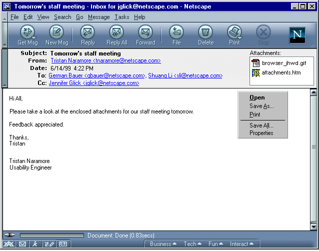
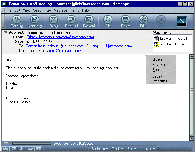
Combine the Subject/From/Date and the To/Cc information in the envelope area. There isn't much use to keeping them separate, in fact, the darker background gives the impression that the To/Cc information is more important.
The attachments are shown in a scrollable list in the right corner of the envelop area. An icon is displayed when possible to give a visual indication of the file type. A generic "document" icon is displayed if the file type is not known. The size of each attachment could be displayed in parenthesis following the attachment name?
Double clicking on a single attachment pops open a "Do you want to save or open the attachment?" dialog. Good for basic users. Most users don't get more than one or two attachments per email.
More knowledgeable users can select one or more attachments and right click/activate the context menu to see more options
(Open, Save As, Print, Properties, Save All). The File menu of an open
message would have "Attachment" as a fly out menu with the same options shown in the context
menu. Properties would bring up a dialog
displaying size and file type information about the selected attachment.
If attachments can be displayed inline, and the user has turned on the pref for this, they are displayed inline below the body of the message.
This keeps message attachments in a prominent position at the top of a message.
Proposal 2
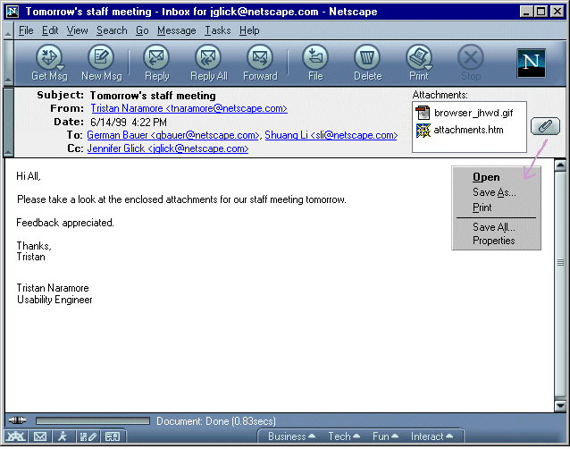
Combine the Subject/From/Date and the To/Cc information in the envelope area. There isn't much use to keeping them separate, in fact, the darker background gives the impression that the To/Cc information is more important.
A listbox in the top right corner of the envelope area displays the attachments included in the message. An icon is displayed when possible to give a visual indication of the file type.
The size of each attachment could be displayed in parenthesis following the attachment name?
Double clicking on an attachment will prompt mail to try and open the attachment if possible. An attachment button appears to the right of the list box. Clicking on the attachment button displays a menu of available options includes: Open, Save As, Print, Save All and Properties. Properties would bring up a dialog displaying size and file type information about the selected attachment.
Menu items in the File menu and Edit menu would duplicate the context menu items?
If attachments can be displayed inline, and the user has turned on the pref for this, they are displayed inline below the body of the message.
Proposal 3
Attachment button in top right corner of envelope area, which indicated the number of attachments. Clicking the button displays a list of attachments, allowing users to open or save individual attachments or save all the attachments.
If attachments can be displayed inline, and the user has turned on the pref for this, they are displayed inline below the body of the message. Attachments which can not be displayed inline, or if the user has turned off this pref, are displayed in a table format (similar to 4.x) below the body of the message.
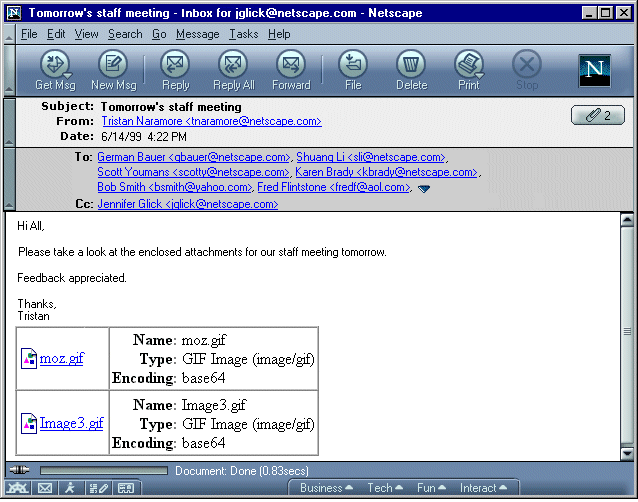
Proposal 4
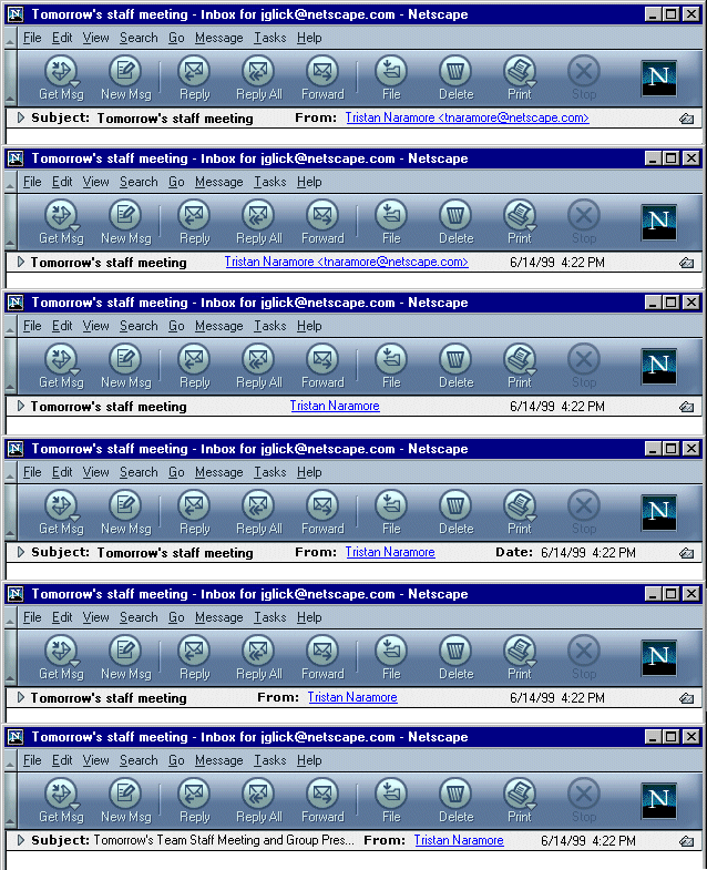
This is the same as proposal 1 above, except the widget used to collapse the envelope area is replaced with a twistie widget.
When the twistie is clicked, the envelop area collapses. Clicking the twistie again expands the envelop area. If a message has attachments, an attachment indicator icon is displayed in the right corner. Clicking the attachment icon expands the envelop area to display the list of attachments.
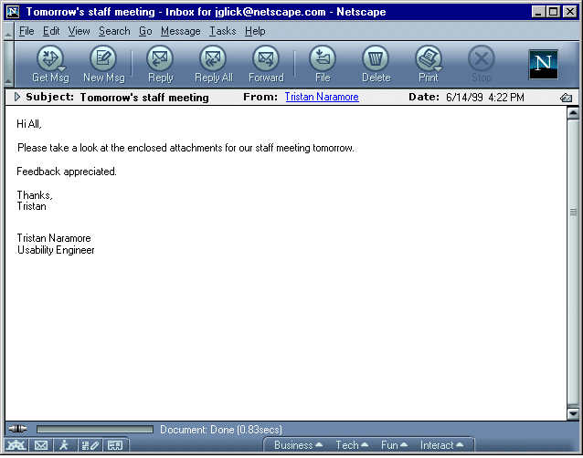
What data should appear when the envelop area is collapsed? How should the information be truncated when there is not enough space?
