Here are some of the goals that we set for ourselves when designing the Communicator 4.0 preferences user interface:
Avoid Technical Jargon
We've made a concerted effort in Communicator to present all the preferences
in such a way so that a user who does not know any technical jargon can
understand the options. To do so, we've avoided relying on technical
terms, such as acronyms. Sometimes acronyms are useful, because they
enable a power user to recognize exactly what the option refers to.
However, if an acronym is absolutely necessary, you should also provide
enough descriptive text so that the user can understand the option without
knowing the meaning of the acronym. Similarly, some terms make perfect
sense to users who have had prior exposure to them, but are not understood
by other users. Avoid such terms, or provide enough descriptive text
so that the option can be understood without knowing the term.
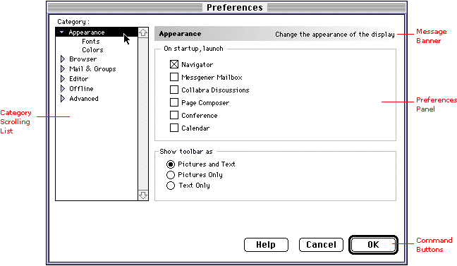
The Preferences window consists of four major areas:
Each area is described in separate sections below.
Category Scrolling List
Preferences are categorized according to the part of the application
they affect. The list is context sensitive so that when the preferences
window is opened from the application, only those which are relevant to
the application are expanded, while the other categories are collapsed.
The panels corresponding to top level categories contain basic, frequently
accessed preferences. The sub-categories contain more advanced preferences.
Message Banner
The message banner is located above the preferences panel. On the left
is the title of the preference panel being viewed (text is bold). On the
right is the message area (text is right-justified). When the user selects
a category from the list, a short description appears in the message area,
which explains what kind of options are available in that category.
Preferences Panel for the Selected Category
As the user selects a category from the scrolling list, the corresponding
panel appears.
Command Buttons
Three buttons have been proposed for the preferences window: