2 Layout and Positioning
2.1 The Box Layout System
View the remaining XUL1.0 box compliance issues in Bugzilla.
The box is one of the fundamental building blocks of XUL. Nearly all of the elements in XUL are boxes. Boxes are containers that define the layout of controls within a XUL document. Boxes lay out their children using a constraint-based system that supports both relative flexible sizing and intrinsic sizing.
In CSS, an inline box can be specified using the 'display' property with a value of inline-box. A block-level box can be specified with a value of box.
The 'float' property does not apply to children of box elements.
[Editor's Note: The following sections introduce new CSS properties that can be used with boxes. Because these properties are not yet part of any CSS standard, they are prefaced with '-moz-' in Mozilla. To use 'box-orient' in Mozilla, for example, you would actually type '-moz-box-orient'.]
Orientation and Direction
| Value: | horizontal | vertical | inline-axis | block-axis | inherit |
| Initial: | inline-axis |
| Applies to: | box elements |
| Inherited: | no |
| Percentages: | n/a |
| Media: | visual |
| Computed Value: | specified value |
A box has both an orientation and a direction. The 'box-orient' CSS property specifies the orientation of the box. It has values of horizontal, vertical, inline-axis, block-axis, and inherit. A horizontal box lays out its children in a horizontal line, and a vertical box stacks its children vertically. The inline and block axes are the writing-mode dependent keywords which, in English, map to horizontal and vertical respectively.
| Value: | normal | reverse | inherit |
| Initial: | normal |
| Applies to: | box elements |
| Inherited: | no |
| Percentages: | n/a |
| Media: | visual |
| Computed Value: | specified value |
The 'box-direction' CSS property specifies the direction of the box. It has values of normal, reverse, and inherit. A normal horizontal box lays out its children from left to right, and a normal vertical box lays out its children from top to bottom.
If direction and orientation are omitted on the outermost box in a box group, it is assumed to have a horizontal orientation and normal direction. Note that some widgets in XUL have vertical orientations as the default. If a widget has a default vertical orientation this will be explicitly mentioned in the widget's definition (see Section 3).
Most elements in XUL are actually boxes. Any box element in XUL supports two attributes for setting orientation and direction. These attributes are orient and dir. The supported values are the same as the corresponding CSS properties. To use a generic box in XUL, the box element can be used.
In addition, two shorthand tags can be used in XUL to describe boxes with specific orientations. hbox describes a horizontal box, i.e., a box with a an inline-axis orientation, and vbox describes a vertical box, i.e., a box with a block-axis orientation.
<hbox>
     <button label="Child 1"/>
     <button label="Child 2"/>
</hbox>

When items are placed in a box without specifying any additional information about their size, then the box sizes the children intrinsically. In other words, the box makes each child only as big as it needs to be.
Notice that in the above example, the two buttons are only as big as they need to be to display all of their text.
Widths can be specified for items inside a horizontal box. When an object specifies its width in CSS, it is telling the box that it would like to be that width. Similarly, heights can be specified in CSS for items in a vertical box. An unnested box placed inside an enclosing CSS block will obey all the usual sizing rules of the block. For example, setting the width of an unnested box to 100% ensures that the box is the maximum width permitted by the enclosing CSS block (ignoring any margins, border and padding on that box).
<hbox>
     <button style="width: 200px" label="Child 1"/>
     <button style="width: 100px" label="Child 2"/>
</hbox>

In this example, the first child is twice as wide as the second child, since it specified a width of 200 pixels. The second child specified a width of only 100 pixels.
Alignment
| Value: | start | end | center | baseline | stretch | inherit |
| Initial: | stretch |
| Applies to: | box elements |
| Inherited: | no |
| Percentages: | n/a |
| Media: | visual |
| Computed Value: | specified value |
The 'box-align' property specifies
how controls are aligned along the orientation of the box. Its
possible values are start, end, center, baseline, stretch and
inherit. The initial value is stretch.
By default a horizontal box ensures that all children are the same
height. Once a height is computed for a horizontal box, all of the
children are stretched vertically to the height of the box (minus the
CSS border and padding on the box). Similarly, a vertical box ensures
that all its children are the same width. The stretch policy
overrides any specified width or height values.
In addition to stretch, a box
can also align its children using the values start, center, baseline and end. For a horizontal box,
start aligns the children along the top of the box, center positions the children
so that they are centered along the axis of the box, end aligns the children along
the bottom of the box, and baseline aligns the children along the text baseline.
A vertical box can align its children using the same values as a horizontal
box, with the exception of baseline. For a vertical box, start aligns
the children along the left side of the box, center positions the chidlren
so that they are centered along the axis of the box, and end aligns the children
along the right side of the box.
When a value other than stretch is used, the box's children are
no longer stretched. They are sized intrinsically and then aligned on
the box axis according to the specified property value on the
containing box.
For XUL elements that are boxes, the align attribute can also be used
to specify the alignment of a box. It has the same values as the corresponding
CSS property.
Items in boxes fall into two categories: flexible and
inflexible. Inflexible objects will not grow, even when
there is extra space left over in the box. An object becomes flexible when the box-flex CSS property is specified for an element.
box-flex has a floating point value
representing the flexibility of the object. Its default value is 0,
which indicates that the object is inflexible. Objects that are
flexible can shrink or grow as the box shrinks and grows. Whenever
there is extra space left over in a box, the flexible objects are
expanded to fill that space. All flex is relative. For example, a
child with a flex of 2 is twice as flexible as a child with a flex of
1. In the above example, the box is 200 pixels tall, which is more
than enough room for the three buttons. Because the first and third
buttons are inflexible, they remain the same size as in the previous
example. The second button is specified as being flexible, and because
it is the only flexible object in the box, it receives all of the
extra space. When several objects in a box are flexible, the extra space is
divided among the objects based on how flexible they are. The box
determines how much space to give an object by adding up the flex
values on all of its children. An object gets an amount of extra space
equal to the percentage of flex that it is responsible for. For example, if two objects have a flex of 1, then after both
objects are given their preferred sizes, the first object gets 1/(1+1)
= 1/2 of the extra space, and the second object also gets 1/2 of the
extra space. Here is another example using objects with different flex values.
For XUL elements that are boxes, the flex attribute can also be used
to specify the alignment of a box. It has the same values as the corresponding
CSS property.
For inflexible objects, the specification of the 'width' and 'height' CSS properties can be used to specify
an object's size. If these properties are omitted, an inflexible
object will be sized intrinsically, i.e., it will be given the minimum
amount of space required to lay out the item. With flexible objects, there are more options. Just as with
inflexible objects, the 'width' and
'height' properties can be used to
specify a preferred size. However, unlike inflexible objects, this
size is only a guideline. A flexible object will stretch as
necessary. It will also shrink if required until it can shrink no more
(e.g., when the object hits its minimum required intrinsic size). In the above example the box is shrinking, and despite the
specification of 1000 pixels as the preferred height, the button,
because it is flexible, shrinks with the box. It continues to shrink
until the minimum required height for the button is reached. After
that, the button can shrink no further. If the box were to continue to
shrink, the button's contents would be clipped, and a portion of the
button would no longer be visible. Items within a box can therefore have their own notions of minimum
and maximum intrinsic sizes. In the above example, the button could
not get any smaller than the minimum height required to draw its
borders and its text. For a more fine-grained control of minimum and maximum sizes, the
'min-width', 'min-height', 'max-width', and 'max-height' CSS properties can be used. When
specified, these properties provide extra information to the box as it
shrinks and grows the object in question. In a horizontal box, for example, if a minimum width is specified,
then the flexible object will not be allowed to shrink below that
width. If a maximum width is specified, then the flexible object will
not be allowed to grow beyond that width. The above example demonstrates the use of 'min-height' and 'max-height' within a vertical box. In the
first image the box has been shrunk until it is smaller than 100
pixels in height. Because the iframe has a specified minimum height of
100 pixels, it is not allowed to shrink any further, and so as the box
falls below 100 pixels, the iframe gets clipped, and portions of it
become invisible. In the second image, the box has been expanded past 300 pixels in
height. Even though the box is getting bigger, the extra space is not
being consumed by the iframe, because its maximum height of 300 pixels
has been reached. It will grow no further. Below is another example illustrating min and max width. In the above example, the box has been stretched so that it is very
wide. The first child has a maximum width of 50 pixels, and it divides
the excess space equally with the second child until its maximum width
has been reached. After that, since it is not allowed to grow any
further, the remaining space all goes to the second child.
For XUL box elements, the attributes width, height, minwidth, minheight,
maxwidth, and maxheight can all be used to specify sizes. Their possible values correspond to the
allowed values
of their corresponding CSS properties.
When all of the items within a box are inflexible or when all
objects have grown to their maximum sizes and can stretch no further,
extra space may be left over in the box. An additional property can
be used to dictate how any additional space should be distributed
between objects. The CSS property 'box-pack' has the possible values of
start, end, center, justify and inherit. The default is start.
In the above example, the button is centered within the box using the 'box-align'
and 'box-pack' properties together. The former centers the button vertically, and
the latter centers the button horizontally.
For XUL elements that are boxes, the pack attribute can also be used
to specify the alignment of a box. It has the same values as the corresponding
CSS property.
Children of a box element can be assigned to ordinal groups
using the 'box-ordinal-group' property. This
property is a natural number value. The default value is 1.
Ordinal groups can be used in conjunction with the 'box-direction' property
to control the order in which objects appear within a box. When the
specified direction is normal, a box will start with the lowest numbered
ordinal group and ensure that those objects appear to the left (for horizontal
boxes) or at the top (for vertical boxes) of the container. Objects with
the same ordinal group are flowed in the order they were declared in the
content model. An object of a lower ordinal group will always appear before an object
of a higher ordinal group.
In the reverse direction, the highest ordinal group appears first, and the
container positions objects from the highest group down to the lowest.
XUL elements support a shorthand attribute for specifying an ordinal group.
The attribute ordinal can be used, and its allowed values are
identical to those allowed by the 'box-ordinal-group' CSS property.
Items within a box can use the CSS 'visibility' property to render themselves
invisible. Boxes behave like tables in that the value collapsed can be used to specify that an item
within a box should not take up any space at all (just like display:none). Flexible objects expand as needed
to fill any space left open by a collapsed item. Items within a box may use the CSS 'overflow' property to obtain horizontal and
vertical scrollbars as needed. Flexible objects that shrink below
their minimum intrinsic size can display scrollbars using the auto value. If overflow is hidden, the object will be clipped
instead. Note that the initial value is visible, which is typically not the preferred
effect in user interfaces. Whether an element is inline or block when placed directly inside a
box is irrelevant. Objects will be flowed horizontally or vertically
based off the 'box-orient' property.
When any raw text nodes are encountered directly inside a box, an anonymous block is constructed
to wrap the text. This anonymous block then participates in the box layout as
a single item. This is the same as in CSS2.
View the remaining stack compliance issues in Bugzilla.
Current CSS provides no means of stacking elements (i.e., positioning one
element on top of another element) within a container while still allowing that
container to be intrinsically sized.
XUL addresses this limitation through the use of a new display type called a
stack.
A stack is defined using the 'stack' display
property. An inline stack can be defined using the 'inline-stack'
display property. All child elements are stacked such that the upper left hand corners
of their margin boxes are aligned with the upper left hand corner of the stack's content
box. If a stack is forced to size intrinsically, then the stack will expand such that all
children can be displayed.
Visibility can be used to control whether or not a child contributes to the intrinsic
sizing of the stack. For example, a visibility of 'collapse' will result in a child
being invisible and will also result in that child being omitted from any sizing
calculations. A visibility of 'hidden' will result in a child being invisible, but
that child will potentially affect the size of the stack.
By default a stack's children are ordered from bottom to top, i.e., the first child
of a stack has the lowest z-index, and the last child has the highest z-index. The
CSS2 'z-index' property can be used to adjust or control
this ordering.
By default children are positioned at (0,0) within the stack's content box. The CSS
properties left and top can
be used to specify an offset from the upper left hand corner of the stack's content
box.
The stack tag in XUL can be used to define a stack. XUL elements also
support left and top attributes that are analogous to the
CSS properties of the same name.
View the remaining grid compliance issues in Bugzilla.
The box can be extended into two dimensions through the use of a
grid element. A grid contains exactly two children,
specialized boxes called grid groups. One group
defines the columns and the second defines the
rows.
In XUL the elements used to describe the grid and its groups are
grid, rows and columns.
A grid is conceptually similar to tables, but
significantly simpler in practice. Conceptually the grid is a stack
that consists of two layers, typically a bottom layer that contains the columns,
and a top layer that contains the rows. The layers can be stacked in any
order, using the same rules that apply to stacks.
All columns and rows in a grid must be specified explicitly.
(Grids are thus simplified by not supporting dynamic discovery of the
number of columns the way HTML tables do). The following additional values for the CSS display property allow
grids to be used from CSS: grid, inline-grid, grid-group
and grid-line. The grid-group and grid-line
properties, when used in conjunction with the box-orient property define the rows, columns, row and column elements.
A grid group is a specialized box that contains grid lines. Each
line defines an individual column or row (depending on the orientation of the
enclosing grid group). In XUL, the tags for grid lines are row
and column. The row element is used inside a rows group, and the
column element is used inside a columns group.
Grid lines contain boxes that make up the cells of the grid, and they can
be placed within either a column or a row. Note that with this layout
it is possible for two objects to be placed within the same (i,j)
position of the grid, one in the bottom columns layer, and the other
in the rows layer.
The 'box-align' and 'box-flex' properties, when specified on a row
or a column, apply to all the cells in the row or column. These
properties are ignored when specified on objects inside a row or
column. The properties on the row and column override. Similarly,
widths and heights and min/max-widths and heights can be specified on
rows and columns and will override anything specified on cells.
Note that 'box-pack' is unnecessary
in a grid, since 'box-align' can be
specified on both the row and column to allow for full control of a
cell's positioning.
A sample stylesheet that defined the XUL elements used in the example
above might be defined
as follows: The rows and columns elements can flex and overflow just as other
boxes can, allowing for scrolling grids in either the horizontal or
vertical direction (e.g., a spreadsheet).
Rows and columns elements can be nested and used in conjunction
with the 'visibility' (e.g., collapsed) and 'overflow' (e.g., auto) properties to obtain a multi-column
tree widget with a scrolling body.
Because the two children of the grid element are just boxes, they
can contain content other than rows and columns. By default this
content will be stretched across the whole grid, e.g., a text area
placed in between two rows would stretch to fill the entire width of
the grid. By allowing other objects within the rows and columns, many
use cases involving spans become unnecessary. Spans, therefore, are
not supported in grids.
View the remaining popup compliance issues in Bugzilla.
XUL defines a new type of widget called a popup. A popup
is a special type of layout object that is not part of the normal flow
of a document. Popups are used to define menus, tooltips, and other
widgets that appear under a mouse pointer or aligned to other content.
The value popup has been added to the 'display' property. When this value is
applied to an element, the following changes apply:
XUL defines three types of popup elements. The menupopup defines a popup
that is used to hold menu items. It is used with menus, menu lists,
and context menus. The second type of popup defined is floatingwindow, and
it is used for floating (e.g., palette) windows. The third type of popup
is the tooltip, and it is used for the display of tooltips.
The behavior of menu popups is handled automatically by XUL.
The menu's submenu popup will show and hide according to the normal menu rules
of the user agent.
XUL also provides shorthands for associating popups with a given element. All
XUL elements support three attributes. These attributes all take as their
values the ID of an element with a popup display type. They also support the
special keyword '_child', which can be used to indicate that the menupopup or
tooltip is an immediate child of the element.
These shorthand forms of the popup syntax hide the details of how popups are
shown and dismissed from the XUL author. However, there are times when the author
will desire precise
control over when the popup should be displayed as well as over the positioning of
the popup.
The
XUL popup elements support a shorthand attribute called position
that can be used to declaratively define where the popup should appear. The possible values
of the position attribute are the string forms of the constants specified in the
XULPopupElement above. These strings are lower case. For example to indicate
that a popup should overlap its target, a popup could be defined as follows.
When the target is a point and not a region, the following constants become equivalent: If the popup is smaller than the screen, then the popup must appear completely on the screen. If, after
aligning the popup as specified by the arguments to the showPopup method, the popup would overflow the screen, then
the following algorithm should be used. The algorithm should be followed step by step until the popup fits on the
screen. Four new events are introduced, all related to popups. These use the base DOM Event interface to pass
contextual information. The different types of such events that can occur are:
During the handling of a popup event (i.e., one of the four events described above), or at any time
while a popup is open, scripts may need to access the node that was originally hit when the popup was first
invoked. This node will always be a descendant of the element to which the popup was attached using
one of the three shorthand attributes (menu, contextmenu, and tooltip), or it will be the element
itself. The XULDocument
interface contains accessors for all three types: popupNode is used for menus and context
menus (since both are never active in XUL at the same time), and tooltipNode is used for the
target of the current tooltip.
<vbox>
     <button label="Cat"/>
     <button label="Piranha"/>
     <button label="Antidisestablishmentarianism"/>
</vbox>

Flex
<hbox style="width: 400px;">
     <button style="width: 200px" label="Child 1"/>
     <button style="width: 100px" label="Child 2"/>
</hbox>

Value:
<number> | inherit
Initial:
0.0
Applies to:
box elements
Inherited:
no
Percentages:
n/a
Media:
visual
Computed Value:
specified value
<vbox style="height: 200px">
     <button label="Cat"/>
     <button style="box-flex: 1" label="Piranha"/>
     <button label="Antidisestablishmentarianism"/>
</vbox>

<vbox style="height: 200px">
     <button style="box-flex: 1" label="Cat"/>
     <button style="box-flex: 1" label="Piranha"/>
</vbox>

<vbox style="height: 200px">
     <button style="box-flex: 1" label="Cat"/>
     <button style="box-flex: 2" label="Piranha"/>
     <button style="box-flex: 3" label="Canary"/>
</vbox>

Preferred, Minimum, and Maximum Sizes
<vbox>
   <button flex="1" style="height:1000px" label="Cat"/>
</vbox>


<vbox>
    <iframe style="box-flex: 1; min-height:100px; max-height:300px;
                   width:300px"
            src="http://www.mozillazine.org/"/>
</vbox>


<hbox>
     <button style="box-flex: 1; max-width: 50px" label="Child 1"/>
     <button style="box-flex: 1; min-width: 50px" label="Child 2"/>
</hbox>

Packing Controls
Value:
start | end | center | justify | inherit
Initial:
justify
Applies to:
box elements
Inherited:
yes
Percentages:
n/a
Media:
visual
Computed Value:
specified value
<box style="box-align: center; box-pack: center;
                 width: 300px; height: 300px">
     <button label="centered"/>
</box>

Ordinal Groups
Value:
<integer> | inherit
Initial:
1
Applies to:
children of box elements
Inherited:
no
Percentages:
n/a
Media:
visual
Computed Value:
specified value
Visibility
Overflow
Inlines and Blocks
2.2 Stacking Elements
2.3 Grids
<grid style="width:300px; height:300px">
    <columns>
        <column style="width: 0; box-flex: 1"/>
        <column style="width: 0; box-flex: 1"/>
    </columns>
    <rows>
        <row style="height: 0; box-flex: 1">
            <button label="Child 1,1"/>
            <button label="Child 1,2"/>
        </row>
        <row style="height: 0; box-flex: 1">
            <button label="Child 2,1"/>
            <button label="Child 2,2"/>
        </row>
    </rows>
</grid>

  grid { display: grid; }
  columns { display: grid-group;  box-orient: horizontal; }
  rows { display: grid-group; box-orient: vertical; }
  column { display: grid-line; box-orient: vertical; }
  row { display: grid-line; box-orient: horizontal; }
  button { display: box; }
2.4 Popups
View the popups test page (Works only in Mozilla)
The XULPopupElement Interface
XULPopupElement interface contains methods for showing
and hiding popups.
interface XULPopupElement : XULElement {
  const unsigned short      BEFORE_START                   = 1;
  const unsigned short      BEFORE_END                     = 2;
  const unsigned short      AFTER_START                    = 3;
  const unsigned short      AFTER_END                      = 4;
  const unsigned short      START_BEFORE                   = 5;
  const unsigned short      START_AFTER                    = 6;
  const unsigned short      END_BEFORE                     = 7;
  const unsigned short      END_AFTER                      = 8;
  const unsigned short      OVERLAP                        = 9;
  const unsigned short      AT_POINTER                     = 10;
  const unsigned short      AFTER_POINTER                  = 11;

  attribute DOMString position;

  void showPopup(in unsigned short alignment,
                 in Element target,
                 in Element anchor);
  void hidePopup();
};
position
showPopup
alignment of type unsigned shorttarget of type Elementtarget is null, then the point representing the (last known) position of the pointing device is
used instead. If the target element is not visible, or if there is it is null but there is no pointing device, then the viewport is used instead. If the
viewport is not visible, then the whole screen is used. This ensures that the popup will appear,
regardless of how it was triggered. anchor of type Elementnull is used, then that implies the element. If the
anchor has no defined position (which can happen if is hidden using
CSS for example) then its closest ancestor which will have a position when the popup is shown is
used instead.
UIException NOT_A_POPUP_ERRUIException HIERARCHY_ERRanchor is not a descendant of the element or if it is an annoymous descendant that is not in the default view.hidePopup
BEFORE_START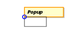 The "before" side of the target is made adjacent to
the "after" side of the anchor, and the "start" sides of the target and anchor are aligned.
The "before" side of the target is made adjacent to
the "after" side of the anchor, and the "start" sides of the target and anchor are aligned.BEFORE_END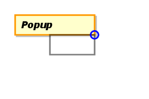 The "before" side of the target is made adjacent to
the "after" side of the anchor, and the "end" sides of the target and anchor are aligned.
The "before" side of the target is made adjacent to
the "after" side of the anchor, and the "end" sides of the target and anchor are aligned.AFTER_START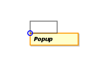 The "after" side of the target is made adjacent to
the "before" side of the anchor, and the "start" sides of the target and anchor are aligned.
The "after" side of the target is made adjacent to
the "before" side of the anchor, and the "start" sides of the target and anchor are aligned.AFTER_END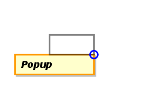 The "after" side of the target is made adjacent to
the "before" side of the anchor, and the "end" sides of the target and anchor are aligned.
The "after" side of the target is made adjacent to
the "before" side of the anchor, and the "end" sides of the target and anchor are aligned.START_BEFORE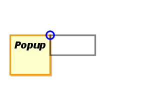 The "start" side of the target is made adjacent to
the "end" side of the anchor, and the "before" sides of the target and anchor are aligned.
The "start" side of the target is made adjacent to
the "end" side of the anchor, and the "before" sides of the target and anchor are aligned.START_AFTER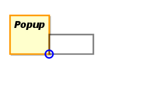 The "start" side of the target is made adjacent to
the "end" side of the anchor, and the "after" sides of the target and anchor are aligned.
The "start" side of the target is made adjacent to
the "end" side of the anchor, and the "after" sides of the target and anchor are aligned.END_BEFORE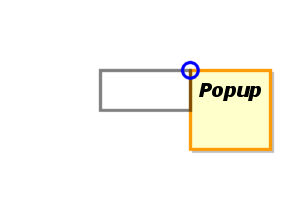 The "end" side of the target is made adjacent to
the "start" side of the anchor, and the "before" sides of the target and anchor are aligned.
The "end" side of the target is made adjacent to
the "start" side of the anchor, and the "before" sides of the target and anchor are aligned.END_AFTER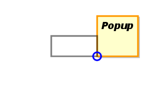 The "end" side of the target is made adjacent to
the "start" side of the anchor, and the "after" sides of the target and anchor are aligned.
The "end" side of the target is made adjacent to
the "start" side of the anchor, and the "after" sides of the target and anchor are aligned.OVERLAP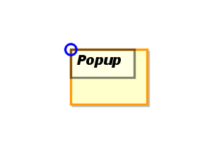 The before/start corners of the target and anchor elements are overlapped so
that (if they have the same size) they appear over each other.
The before/start corners of the target and anchor elements are overlapped so
that (if they have the same size) they appear over each other.AFTER_POINTER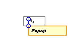 The "after" side of the target is made adjacent to
the "before" side of the anchor, and the "start" side of the anchor is aligned with the
last known position of the pointing device, if any, or with the "start" side of the target, if
there is no pointing device.
The "after" side of the target is made adjacent to
the "before" side of the anchor, and the "start" side of the anchor is aligned with the
last known position of the pointing device, if any, or with the "start" side of the target, if
there is no pointing device.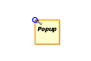 If the
 target is null and there is a pointing device, then
the last known position of the pointer is used as the target in the cases above. So for example, if alignment is set to BEFORE_START or END_AFTER, then the before/start corner of the popup is positioned at the pointer.
<menupopup position="overlap">
  ...
</menupopup>
'overflow' property applies).OVERLAP and the anchor is not the popup element itself, then position
the anchor as required, then shift the popup such that it touches the sides of the screen where the anchor overflows
the screen (if that is in only one direction, the other axis therefore remains unaffected), and apply the 'overflow' property at that scroll position.Popup Display Events
popupShow method is called.
This event is only valid for elements whose 'display' property
has the value popup. If the event is cancelled or if false is
returned from the event handler, then the popup will not be shown.
popupHide method is called.
This event is only valid for elements whose 'display' property
has the value popup and which are currently displayed. If the event
is cancelled (or if the event handler returns false), then the popup will remain visible.